1960s-1970s Transatlantic Suite and other Screenprints
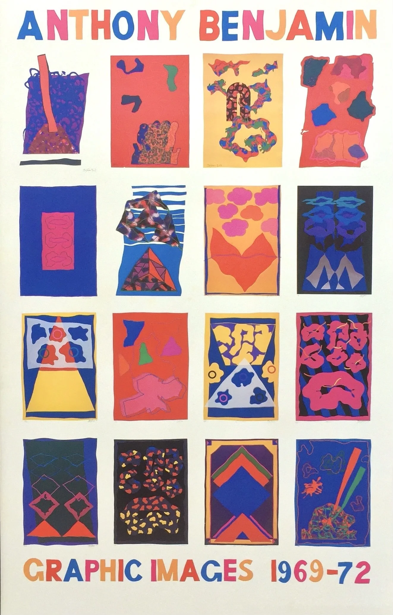
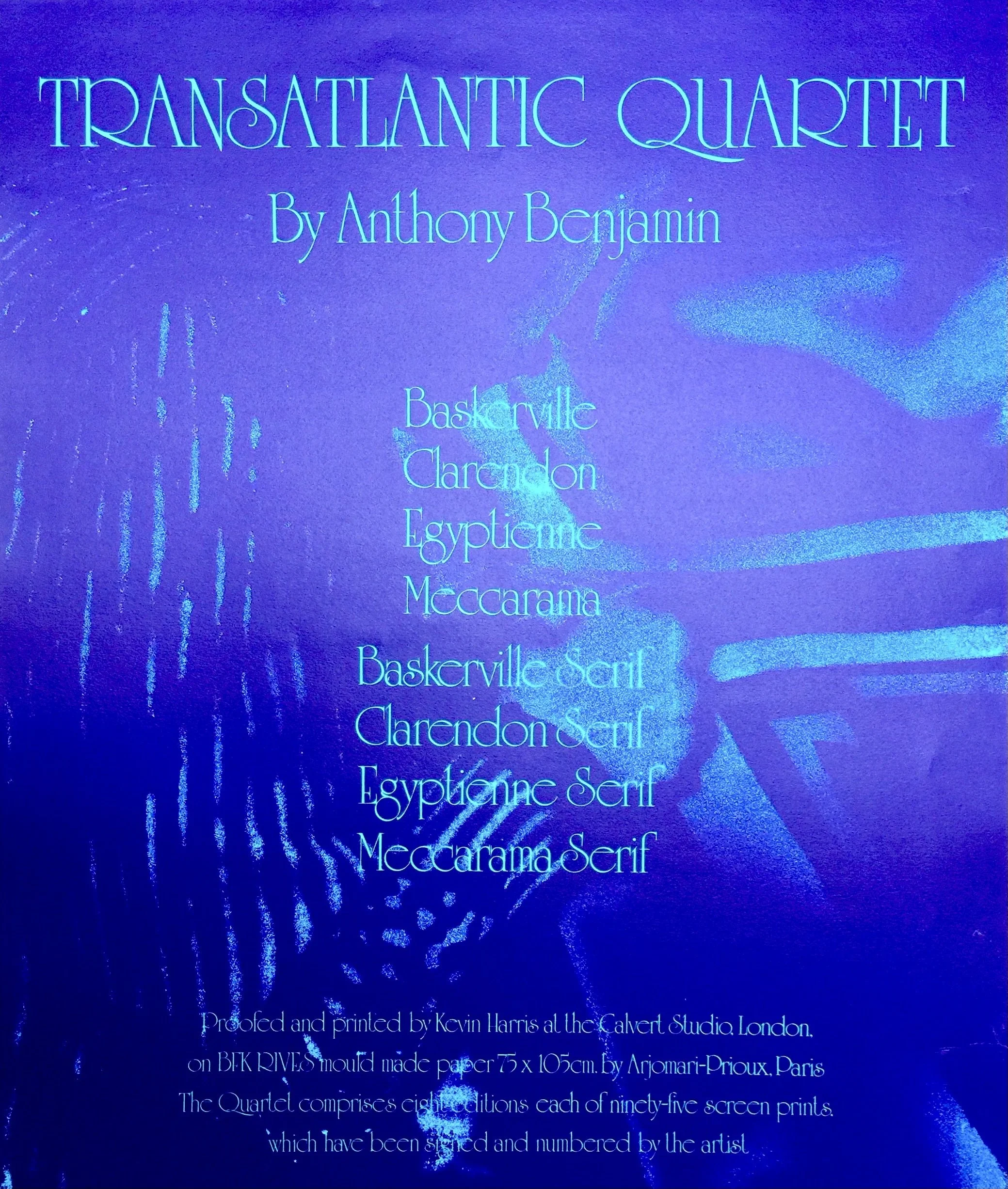
When naming the images, Benjamin chose four favourite type faces, with two versions of each set of stencils.
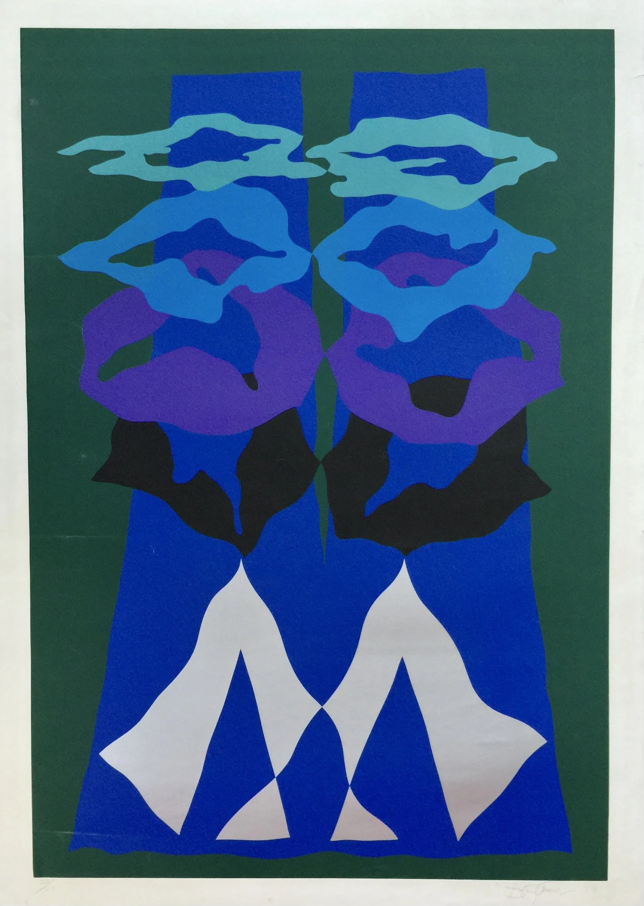
Poltergeist, 1970, screenprint
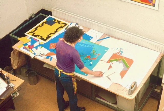
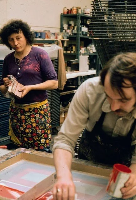
Benjamin and Kevin Harris, a very experienced screenprinter, hit it off immediately. Kevin was not only a perfectionist craftsman, he was also a great collaborator. Working closely, they developed a unique proofing process that allowed Benjamin to find the intense colour impact he was seeking by coordinated experiment. Using full-sized sheets of BFK Rives handmade paper, Kevin printed the flat backgrounds in as many different colours as they could mix; sometimes the backgrounds were graduated tonal blends. Complex images were built up with multiple over-printings, as they tried as many colour-ways as possible with each stencil to arrive at the most vibrantly glowing combinations. Benjamin was travelling back and forth between London and Canada, so the prints he worked on with Kevin Harris were named Transatlantic Suite.
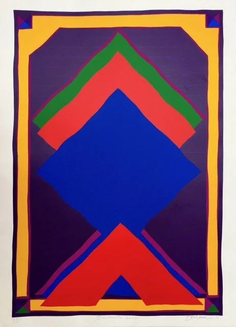
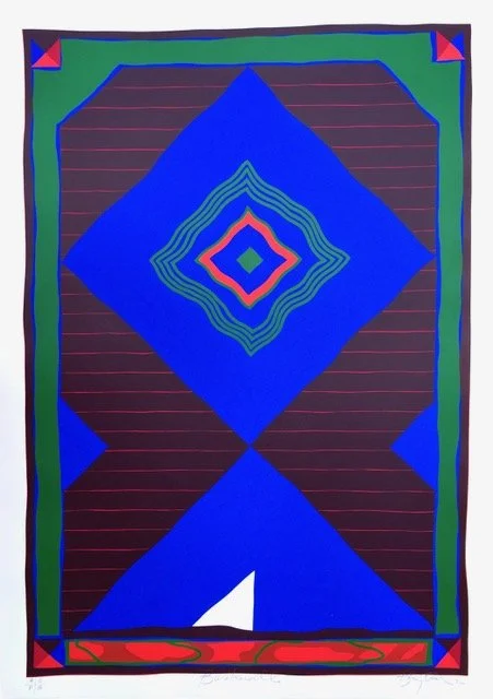
Baskerville Serif, 1972, screenprint
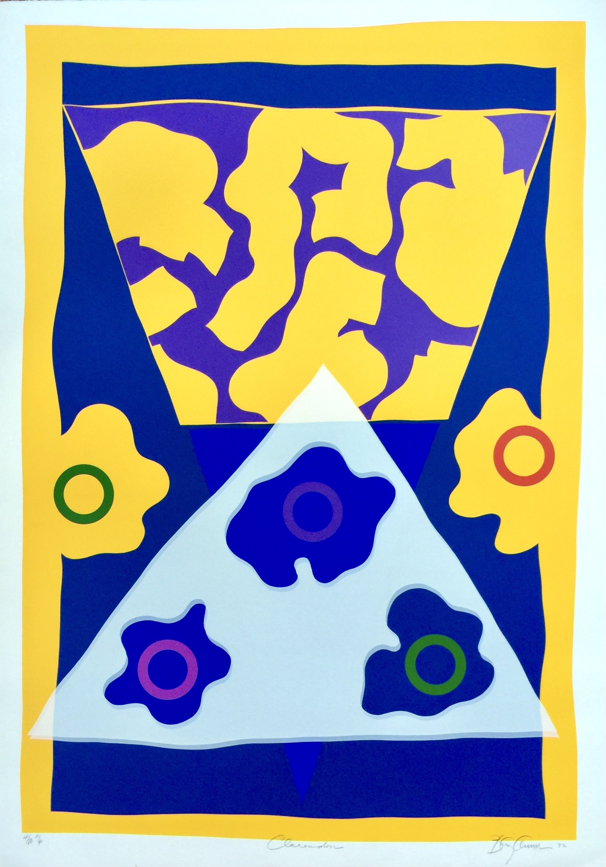
Clarendon, 1970, screenprint
Baskerville, 1972, screenprint
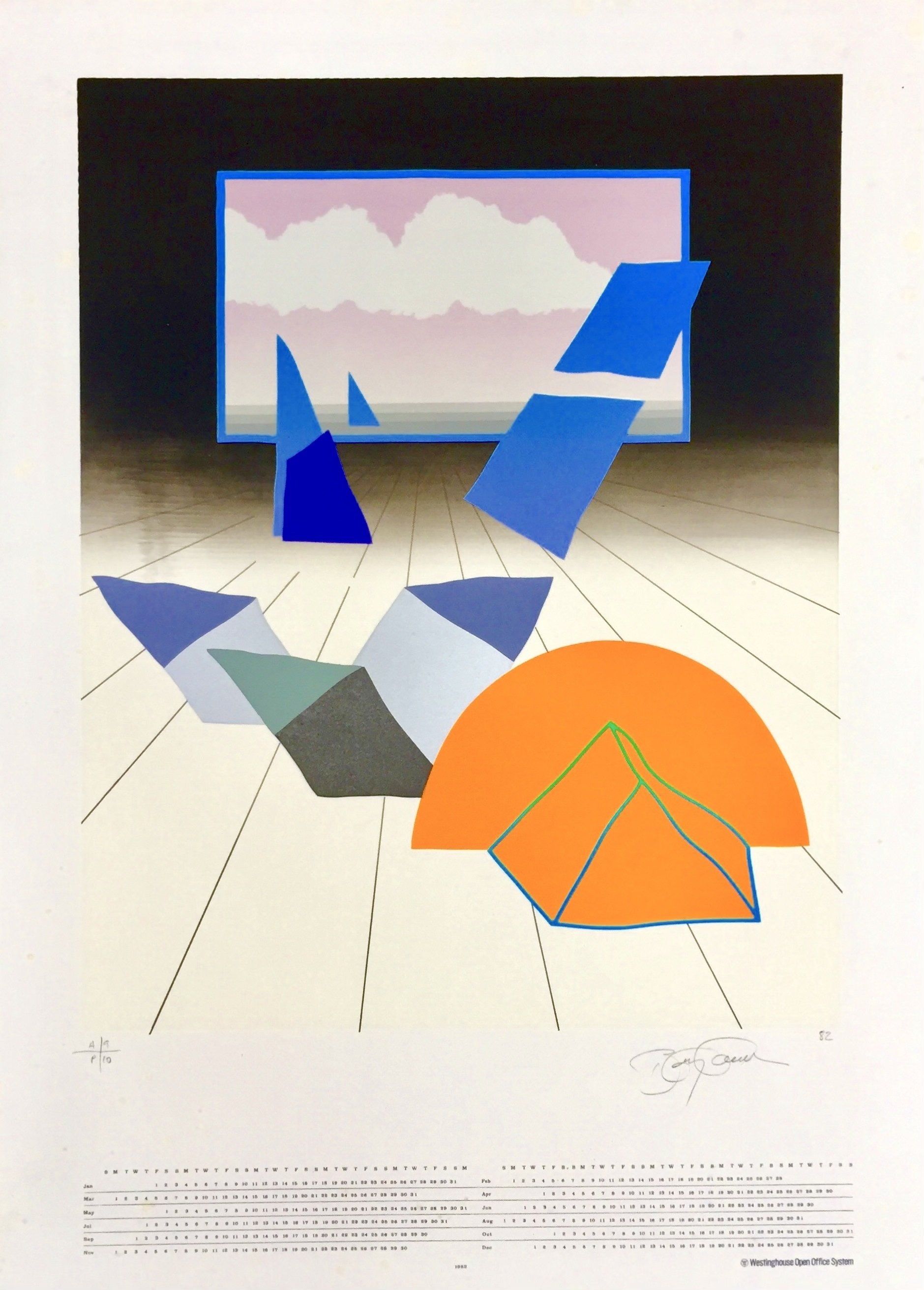
Calendar commissioned by Westinghouse, 1972
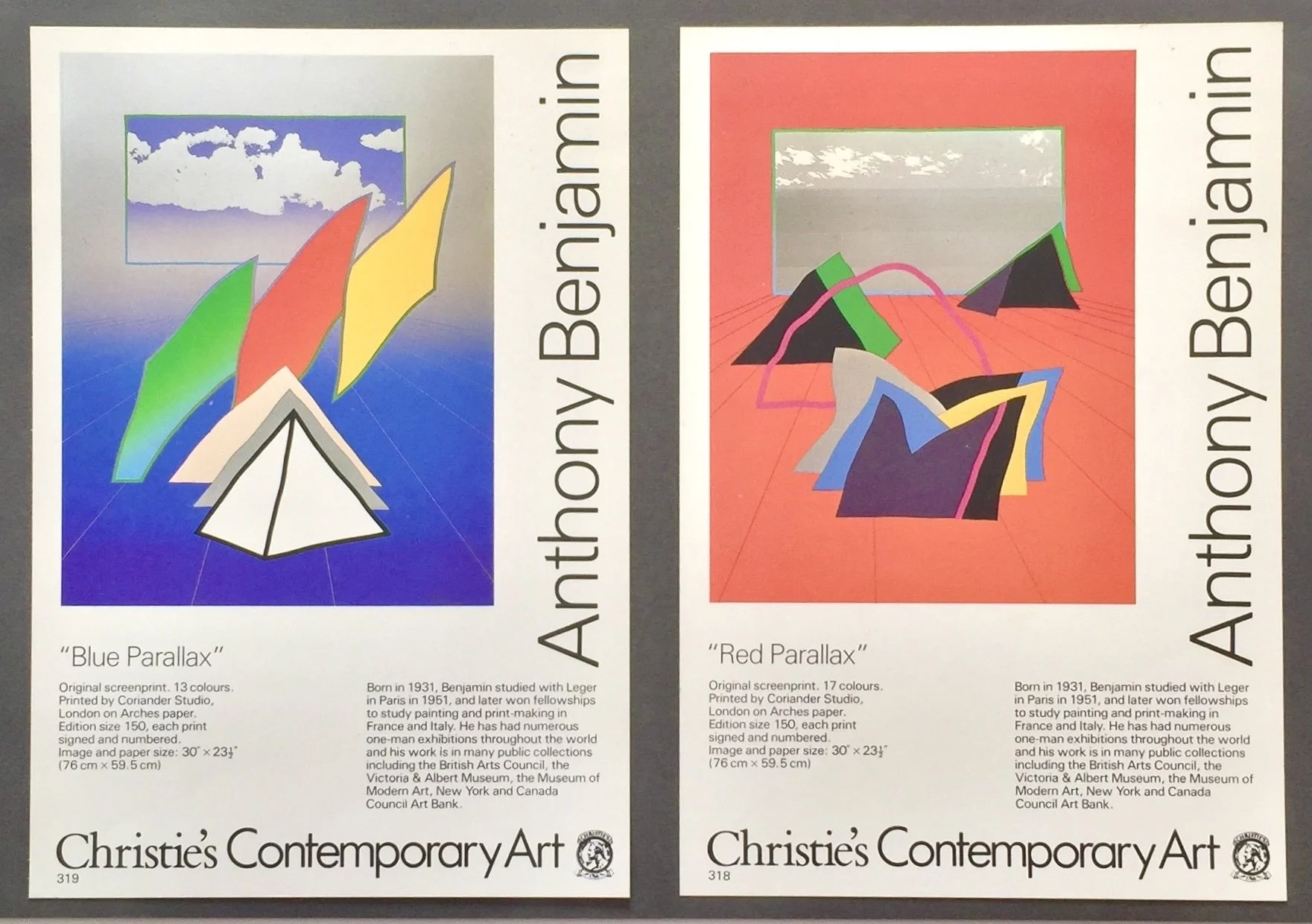
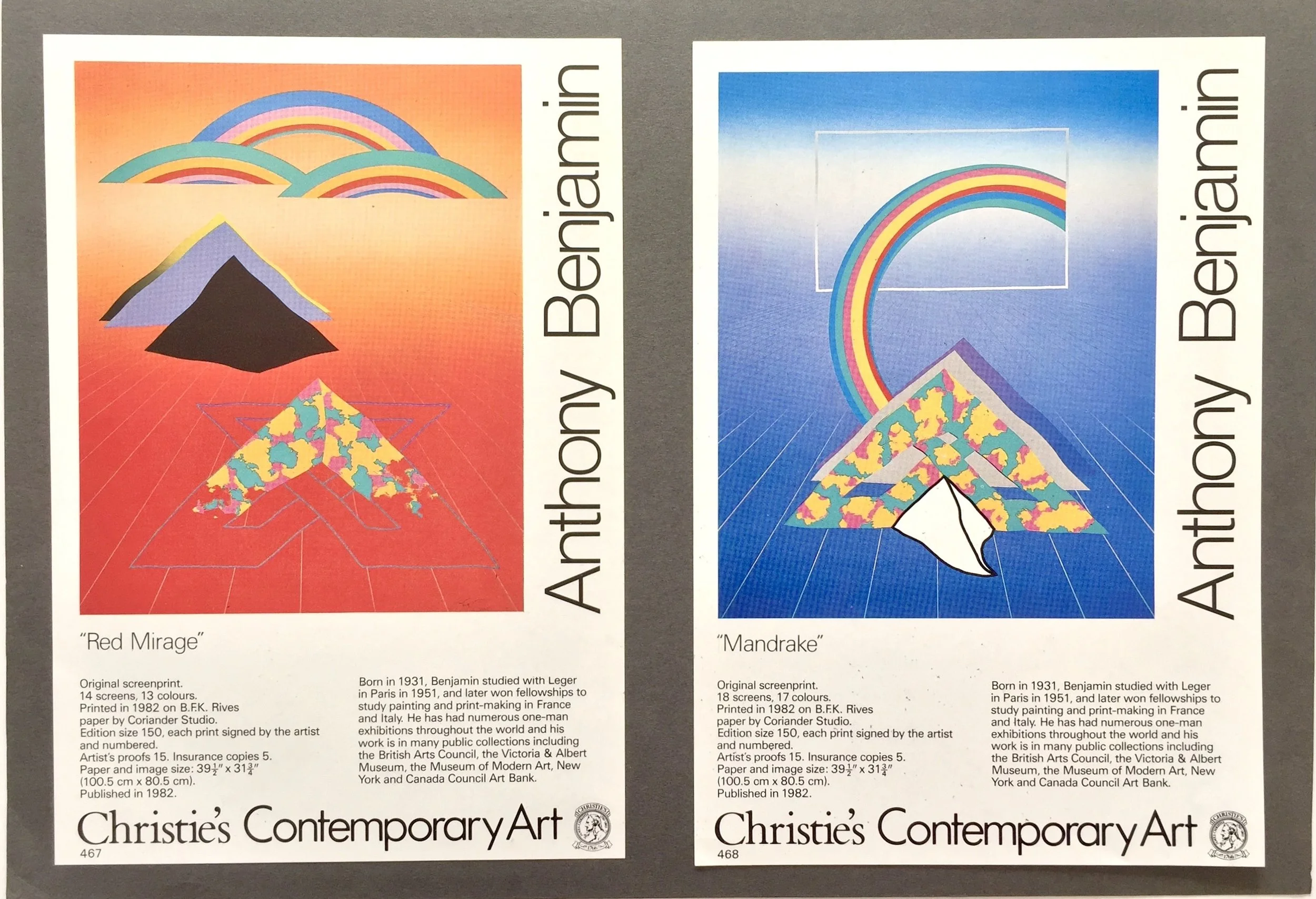
When Christie’s got into publishing limited edition prints, the department was headed by David Case. He liked Benjamin’s work and went on to publish a series of his screenprints that looked good and sold very well. The vibrant images used perspectives that disappeared into cloudy spaces, with references to three-dimensional pyramid forms on top of a perfectly blended background that Harris had skillfully printed. Benjamin’s fascination with rebel Egyptian Pharaoh Akhenaten and pyramids, and reference to pyramid forms continued to turn up in his drawings and prints ever after.