1970s London, Etching: Clarendon Graphics
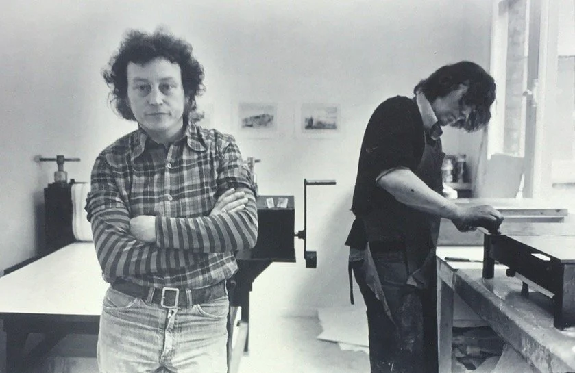
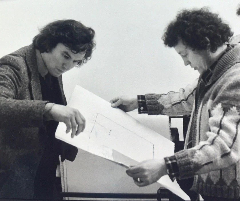
Benjamin’s enthusiasm for etching increased and he installed plate-making equipment and a printing press in his studio in the garden at Liverpool Road and started publishing etchings as Clarendon Graphics. He was working with Glenn Mingham, a fine printer; they gradually increased the use of colour using a precise, labour-intensive technique known as à la poupée.
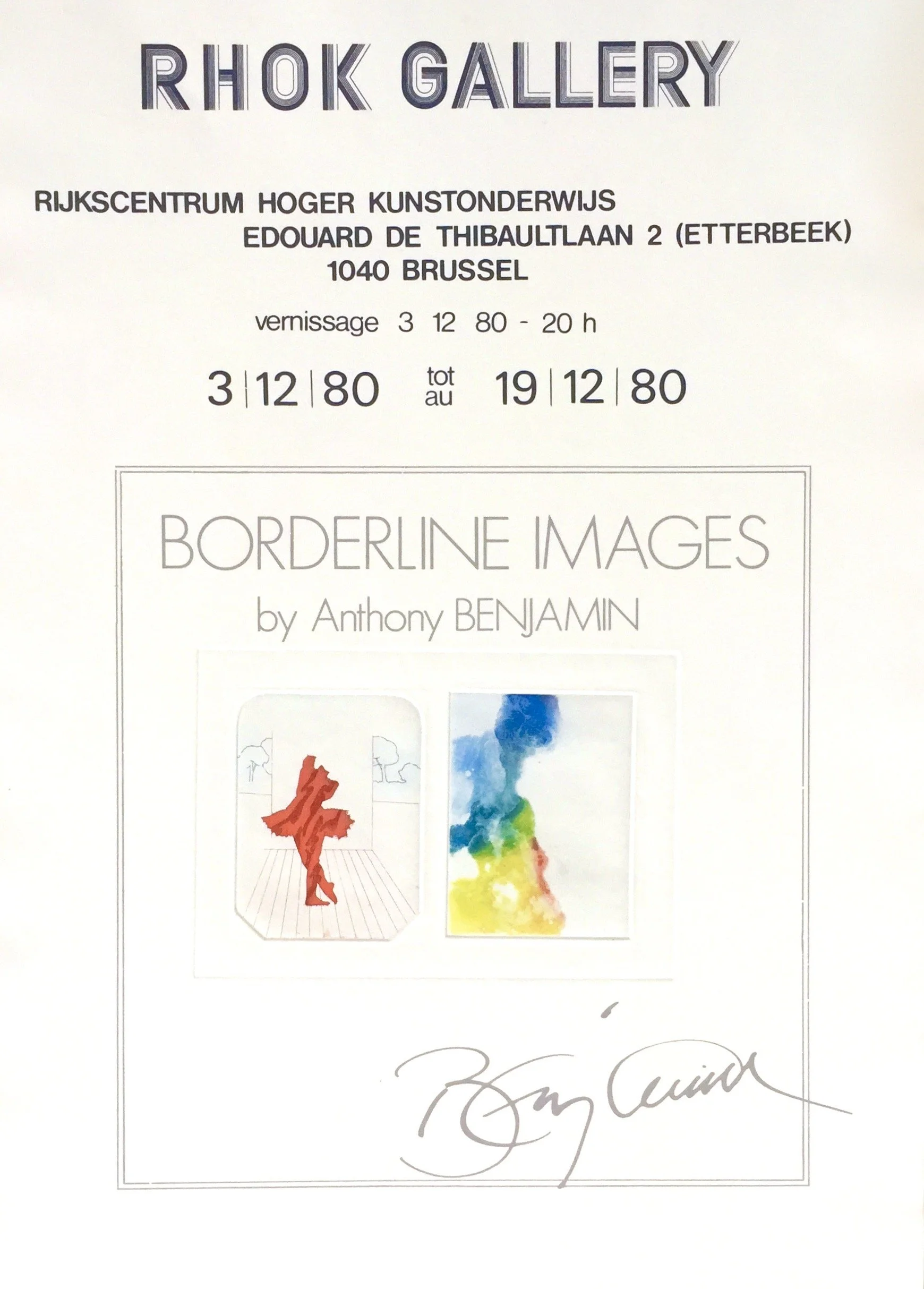
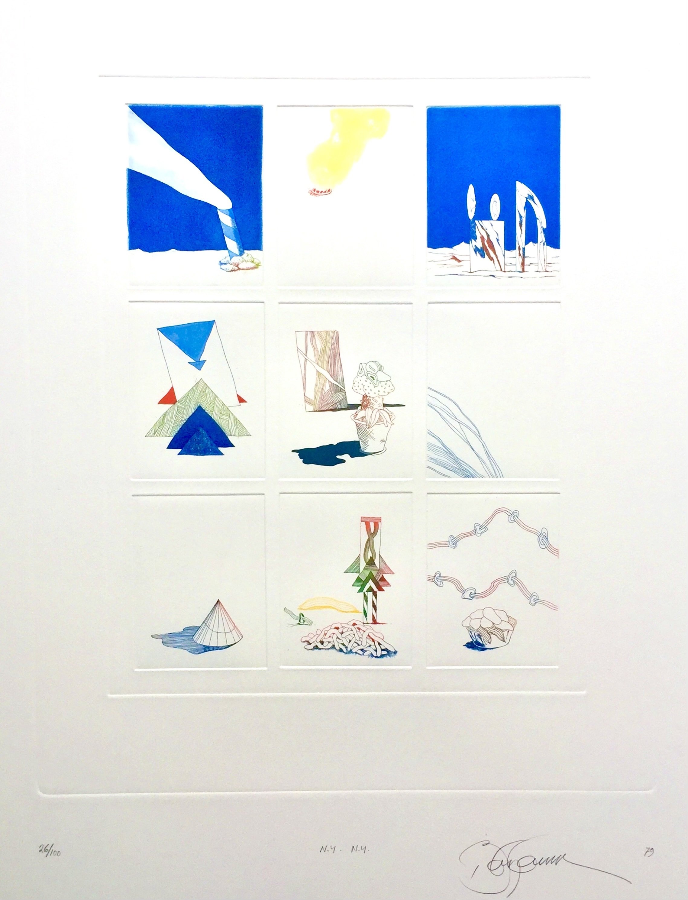
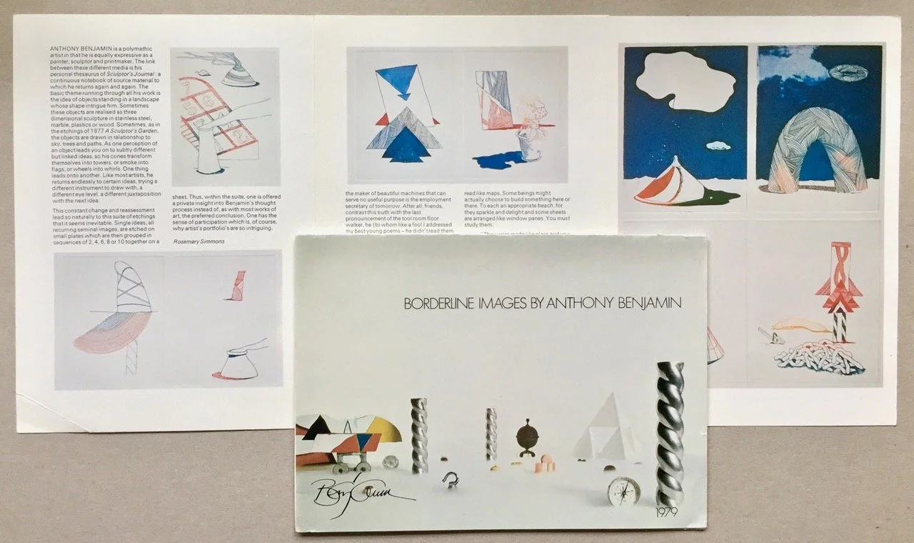
This involved inking with fine-pointed Q Tips so the borders of the coloured areas could have sharp edges, not blended, or faded out. This printing process was used when Benjamin started working on the complex Borderline Images Volume 1, a portfolio of 10 assemblage etchings, at Clarendon Graphics studio in 1979.
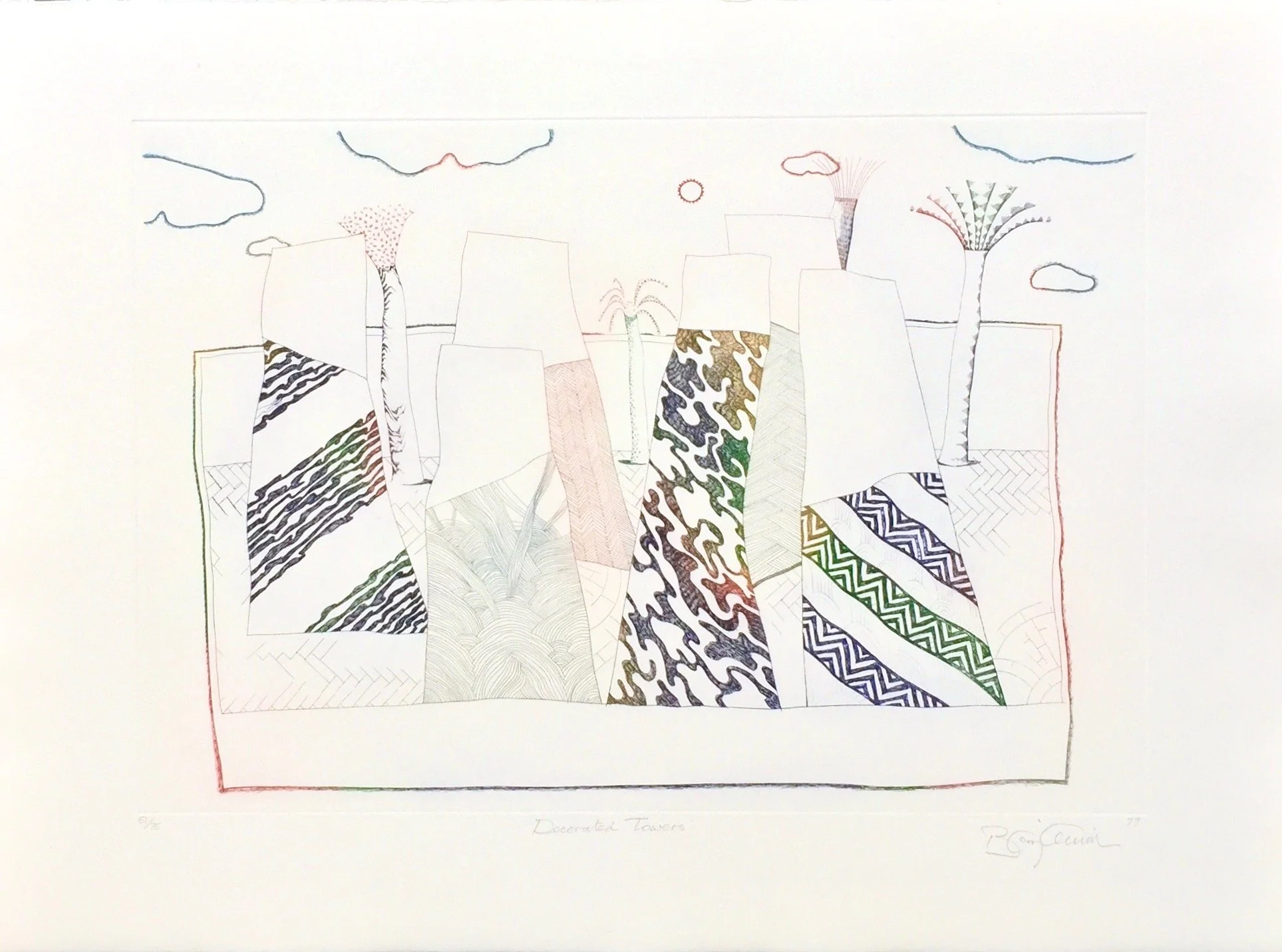
Benjamin became fully engaged with printmaking in the mid-1960s in Britain and then in Canada and the USA from 1968, which he enjoyed and which provided good returns. When back in Britain in the early 1970s, working with Kevin Harris on screen prints, he also began working with dedicated intaglio printer, Hugh Stoneman, starting with a Sculptor’s Garden and the Sculptor’s Sketchbook series that used limited colour.
Decorated Towers from the Sculptor’s Garden Series, 1969. Printed by Hugh Stoneman
Title Page: A portfolio of 10 assemblage etchings by Anthony Benjamin. Proofed and printed by Glen Mingham on satin finish 300 gr. Somerset paper 56 cm by 76 cm at Clarendon Graphics studio. Each print is numbered out of 100 copies, signed and dated by the artist. The first 30 sets of the portfolio are presented in a hard cover and include this title page which is limited to 30 numbered copies, and 10 numbered copies of the artist’s proofs.
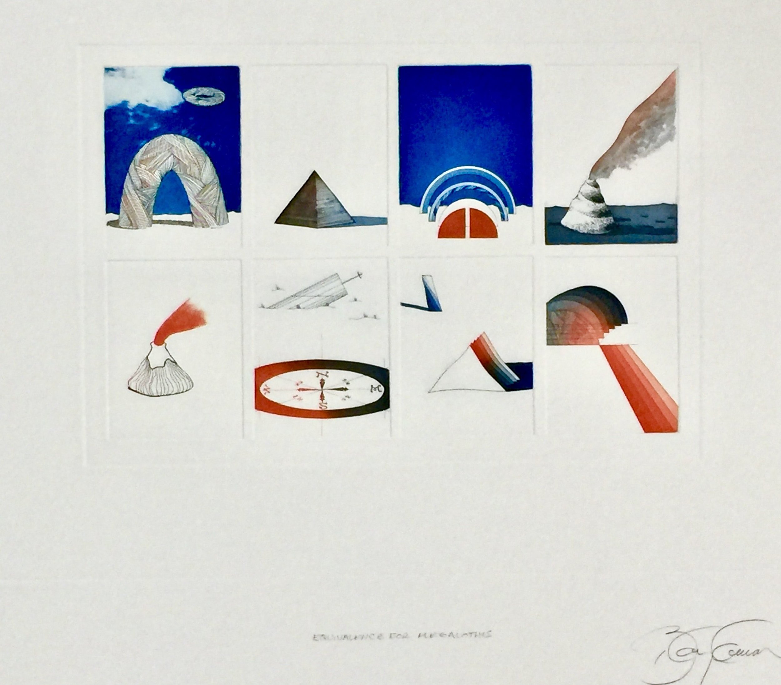
The 10 images were like an abbreviated diary of Benjamin’s art and life. Each image was made up of varying combinations of small plates, 8 cm by 10 cm, in varying groups that involved 3, 4, 6, 8 or 9 plates, in both horizontal and vertical arrangements. The images on the mini-plates were a collection of his favourite visual preoccupations—kites, cakes, deserts, smoke plumes, pyramids, a compass, details of his sculptures, and a range of oddities. Titles included Equivalence for Megalothis—(a favoured saying of his beloved Grandma), 8 plates printed in bright red and blue, N.Y. N.Y.—a place of urban surprise, 9 plates printed in red, blue, yellow and green, and Columbus, a simple four-plate image with a compass and a rainbow on a horizon.
The complex printing process required absolute precision from both Benjamin and Mingham. The project went well and was featured in many exhibitions, and public collections, including the Tate and the Victoria and Albert Museum, London.
Each of the 10 etchings in the suite was composed of small plates which are then grouped in sequences, together on a sheet. Thus, within the suite, one is offered a private insight into Benjamin’s thought process instead of, as with most works of art, the preferred conclusion.
Rosemary Simmons, Arts Review, 1979
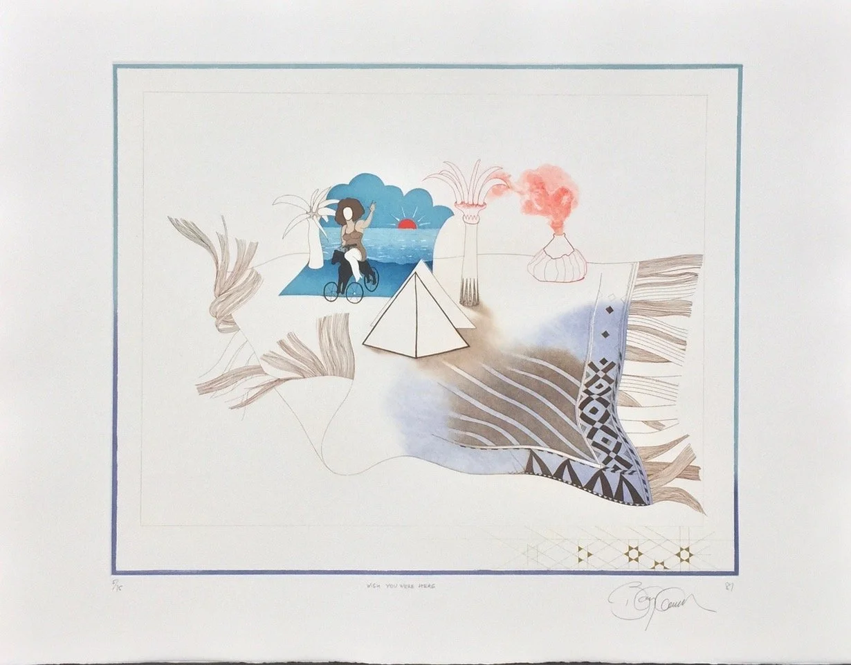
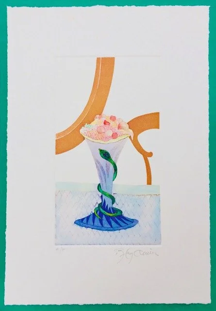
By the time Borderline project was completed, he had become totally engrossed in the intaglio process; he then produced two very different fanciful images—Wish you were here and Timepiece, both of which incorporated a very full range of plate making and colour printing technique.
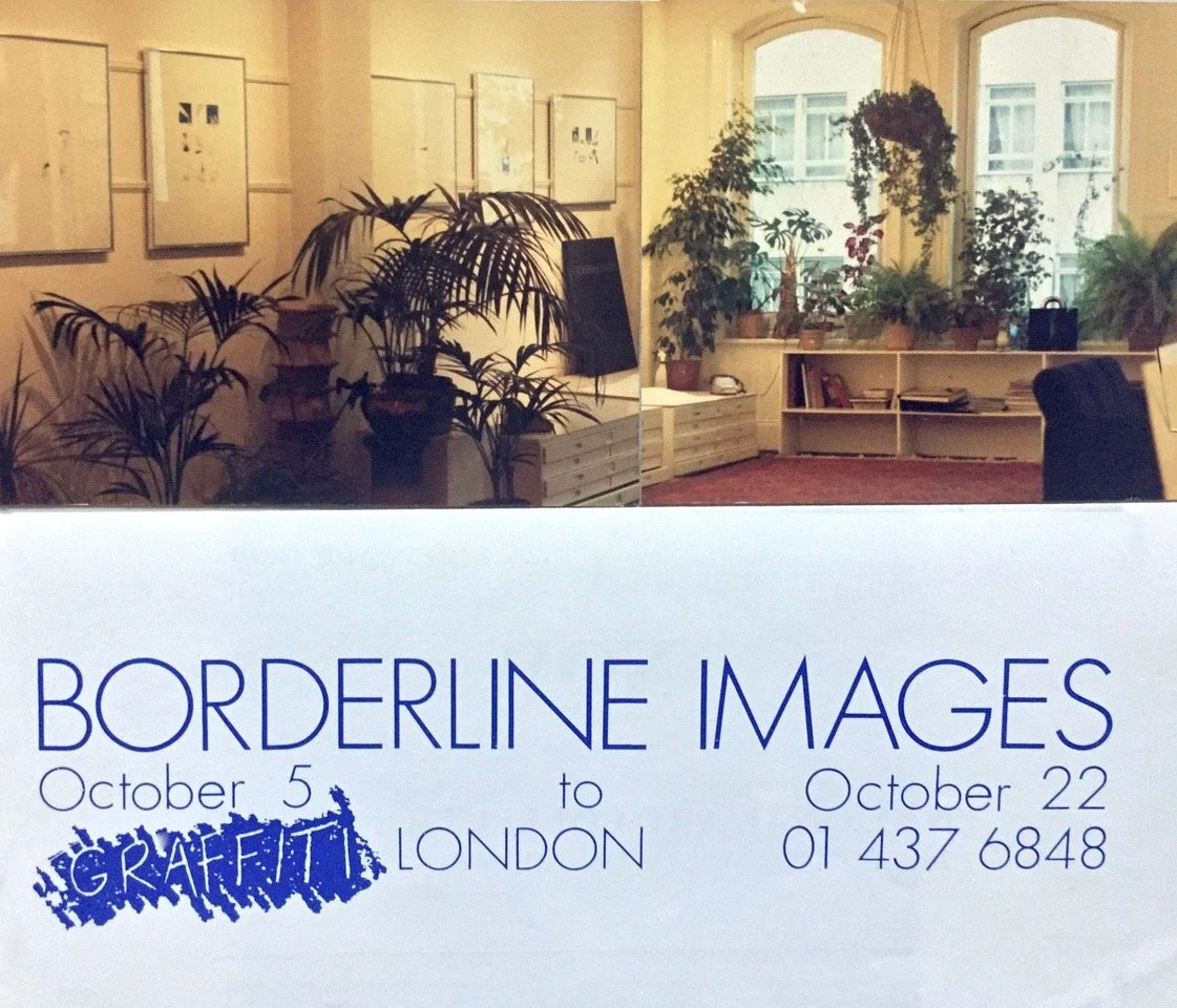
Catalogue for exhibition, Borderline Images, at Graffiti Gallery, London, 1979
Wish You Were Here, 1981. Edition of 75
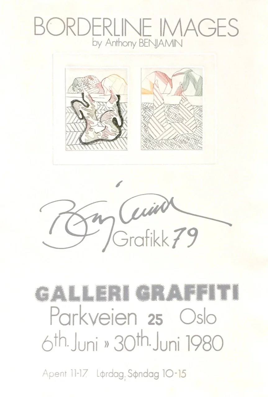
The Graffiti Gallery became a distributor of Benjamin’s printmaking. Late one evening in early 1979, the unusual upstairs gallery was discovered by a visiting Swede named Lars Hedman, who started up Graffiti Svenska, showing Benjamin’s work. Hedman had noticed the bright lights shining out of the big windows on the third floor of the old building, while the rest of the building and most of Great Marlborough Street was very quiet and dark, and he was drawn in.
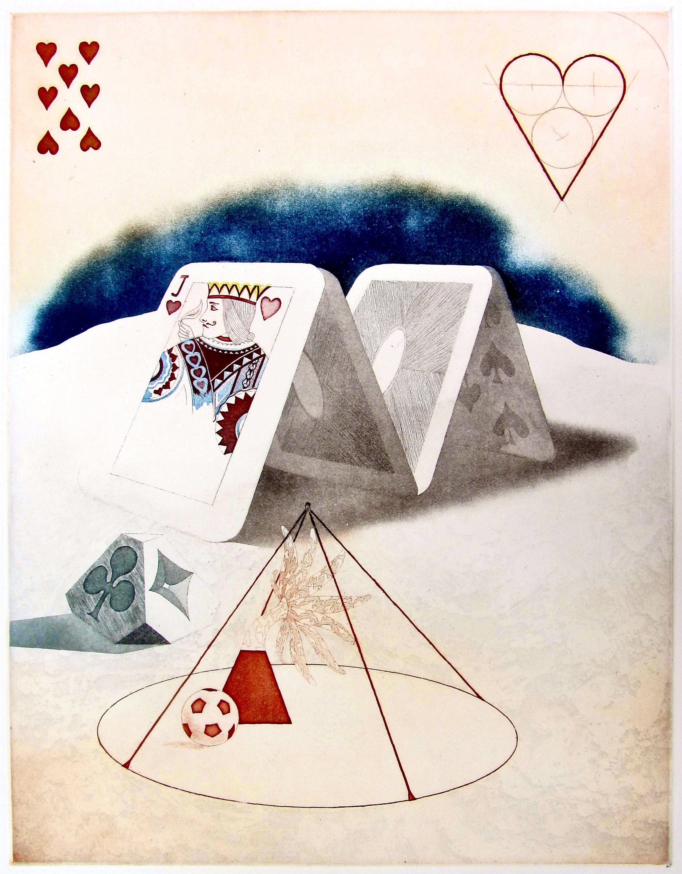
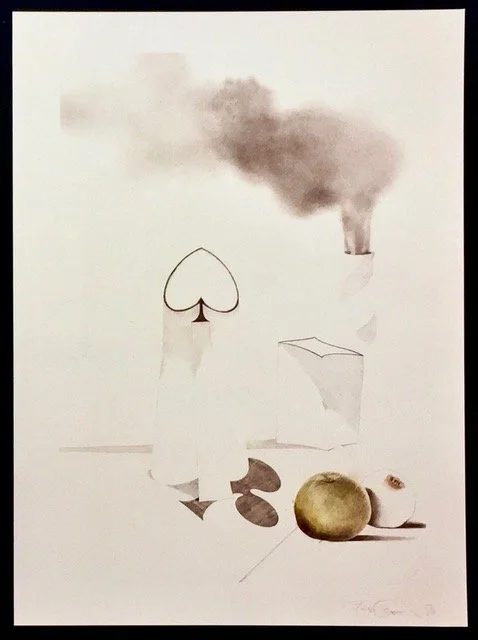
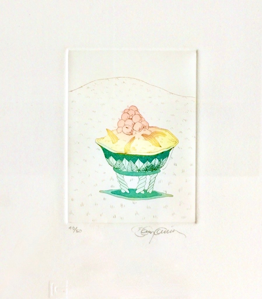
Equivalence for Megalothis, 1979
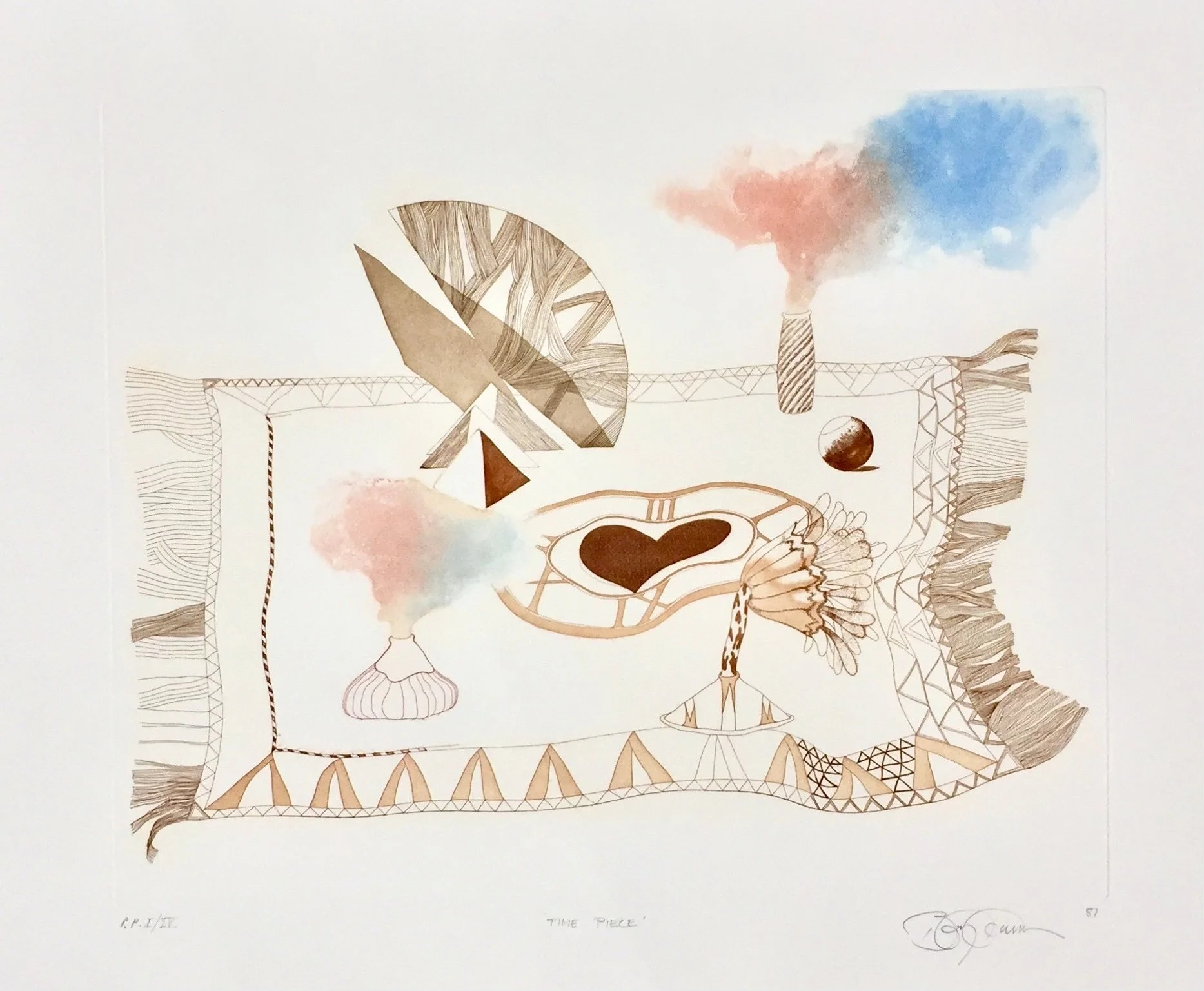
Time Piece, 1981. Edition of 75
Borderline Images were shown internationally.
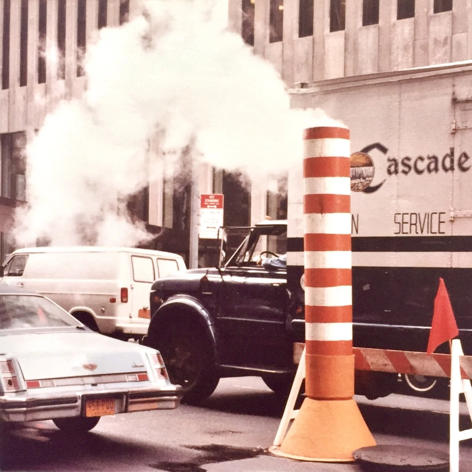
While in New York in 1970, Benjamin was astonished to see smoke plumes during street work. This became a frequent motif in his etchings.
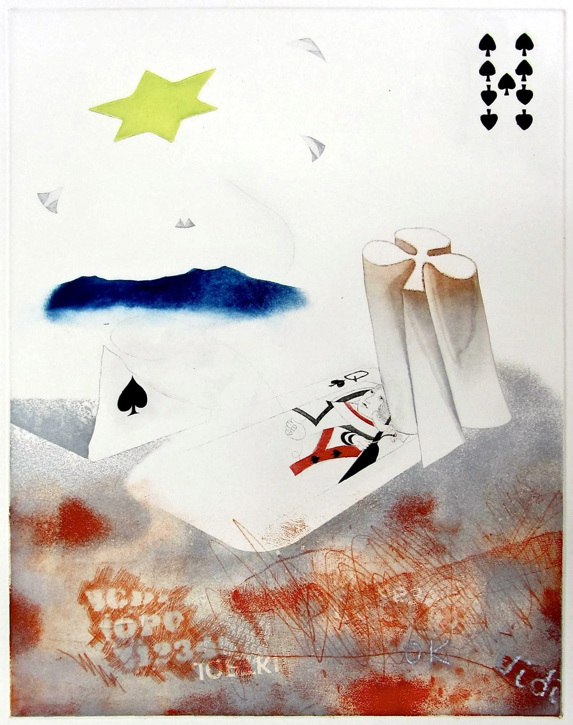
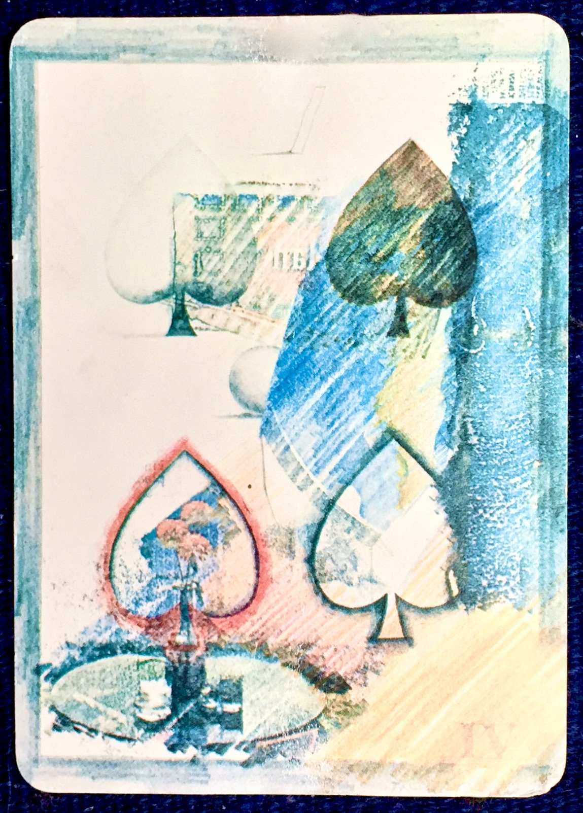
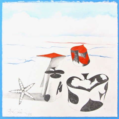
Benjamin was invited by Andrew Jones to be part of a group of 56 artists in a project to design The Deck of Cards in 1977. He was assigned the four of spades and continued to use card motifs in his etchings and drawings.
He also had a great interest in cooking, particularly decorative desserts, which became a frequent subject in his work. Kites were also a feature in his work, as seen in Mrs. Beaton’s Box Kite, below.
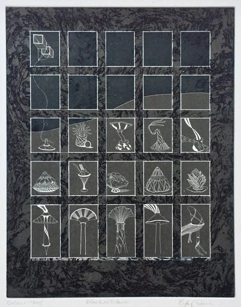
Black on Black or Mrs. Beaton’s Box Kite, 1977
This was printed with a special intaglio technique to make white line images on a coloured background.