1972 Roxy Bias Suite Screenprints
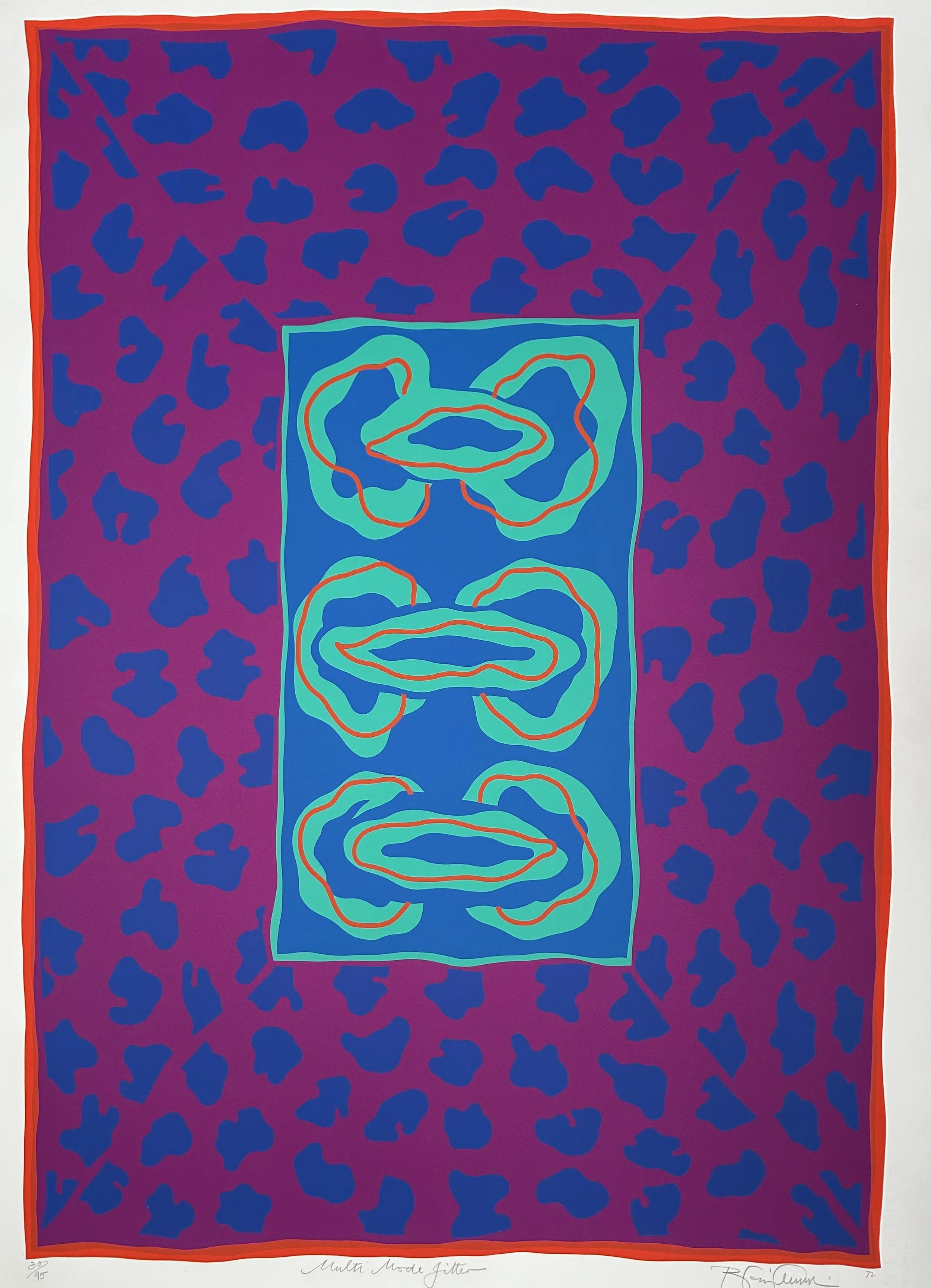
Multiple Mode Jitter from the Roxy Bias Suite of screenprints, 1972.
There is no need to speak of the beauty of Anthony Benjamin’s most recent work. As the advertisements say, ‘It just needs to be seen’.
Norbert Lynton, Studio International, 1972
The collaborative creative process that Anthony developed with Kevin came to full fruition when Anthony became enthused and inspired by the long conversations with Brian Eno about the new creative possibilities inspired by developments in electronic music. Eno was Benjamin’s student, first at Ipswich School of Art and then on the Diploma Course at Winchester Art College. Anthony was eager to create images to parallel sonic effects of electronic music by producing the ‘maximum visual aggression’, a term that Eno came up with. The result was a dazzling set of six images, named the Roxy Bias Suite. The vibrant colours, used with careful consideration and fine tuning of hue and tone, moved, bounced and danced in both two and three dimensions within the confines of each image, as well as interacting with the other images in the suite.
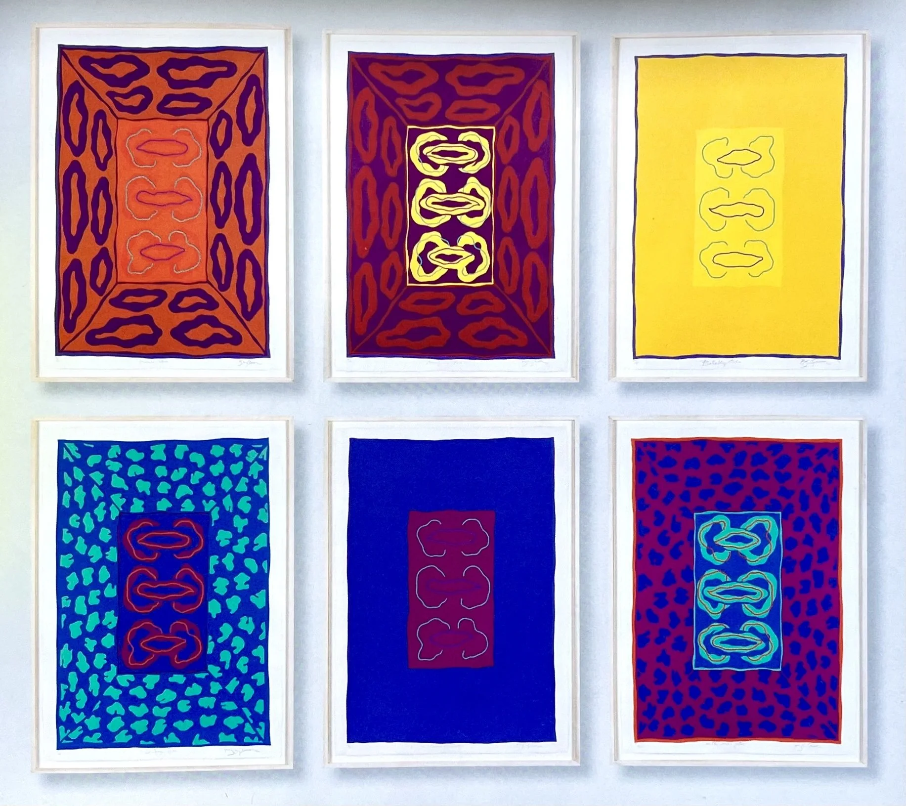
The Roxy Bias Suite of screenprints, printed on 105.5 cm x 76.5 cm BFK handmade paper by Kevin Harris at Calvert Studios in 1972. Each signed, dated and numbered in an edition of 95.
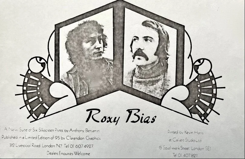
Anthony and Kevin Harris, advert for the suite of prints in the Arts Review, November 1974
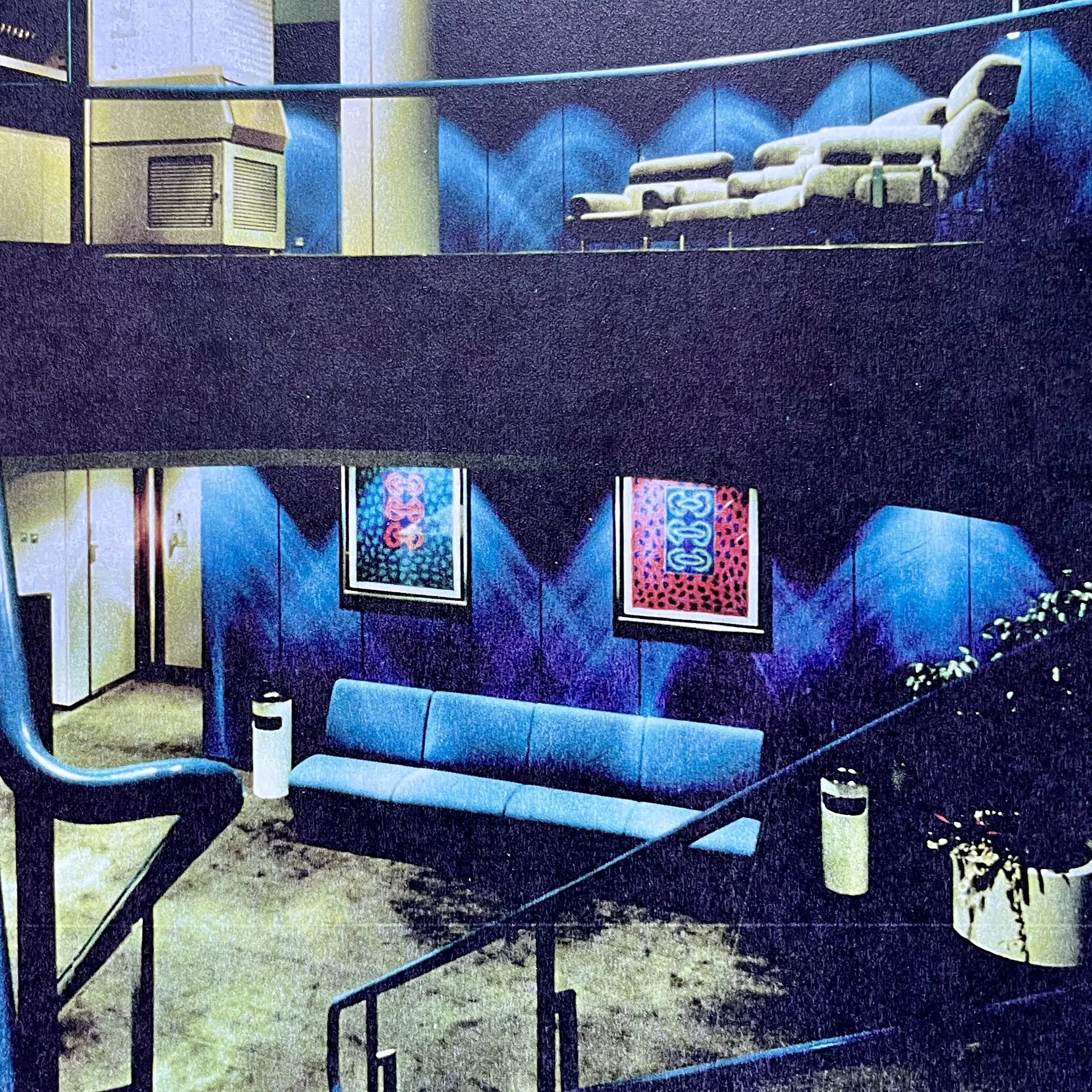
‘O’ Factor (left) and Multi-Mode Jitter (right), Xerox London Headquarters, 1972
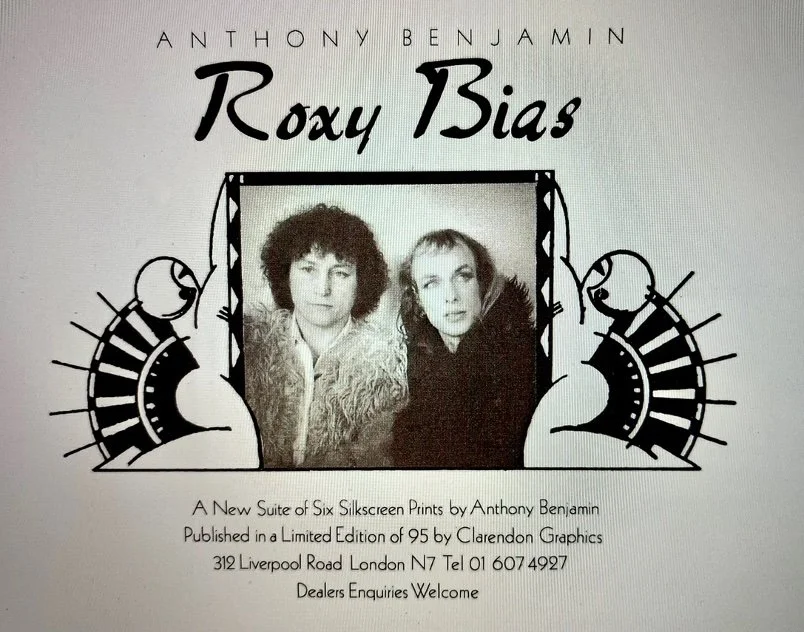
Anthony and Brian Eno in an advert for the suite of prints in the Arts Review, October 1974
Ringing Filter, Inverse Echo, Erase Function, Butterfly Echo, ’O’ Factor, Multi-Mode Jitter—the titles of electronic music functions, terms that Benjamin picked up in wide-ranging conversations with Eno about the creative process as applied to electronic music as well as visual arts.
When making a print, Benjamin did not make a definitive image to work from; he had an idea or a concept, then cut the stencils freehand and experimented with colours before commencing the proofing. Sometimes in the development of an image he would decide to use a light, not fully opaque colour, possibly a chrome yellow over a saturated red. This would require an extra underprinting in opaque white, using the same stencil that would eventually be printed in yellow in order to block out a strong red/purple background, before translucent yellow was printed over the white.
This is how the vibrant yellows in the Ringing Filter image were achieved. Tiny overlaps making narrow lines around each form appear to be in lighter tones, helping to activate the main colour and causing the forms to have an appearance of floating off the surface. This exacting process required absolute focused technical attention which Kevin was willing and able to give.
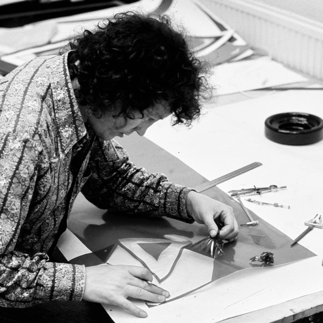
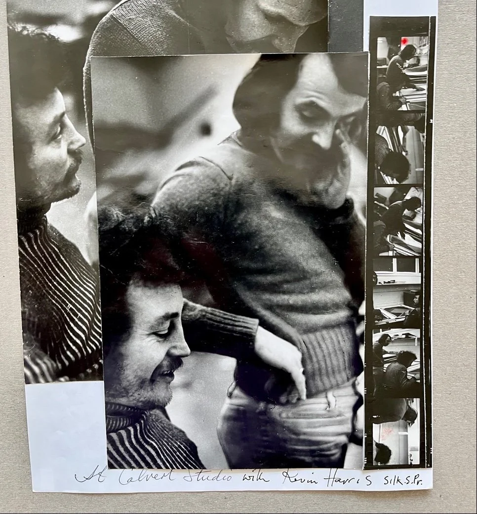
Benjamin and Kevin Harris at Calbert Studios, London, 1972
The suite of prints was an immediate commercial success and won prizes at Biennales in San Paolo, Cracow and the Ontario Arts Council. There is a set in Tate Graphics Collection, as well as many corporate, public, and private collections. Benjamin revisited this creative colour layering process in his later paintings 1998−2002, which were initially inspired by the vivid colour and vibrant music he discovered in Morocco in his later life.