1963-65 London and Oxford: Painting
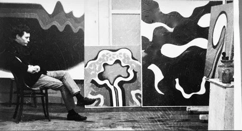
Studio photo: Lewis Morley
Benjamin had returned from Italy full of enthusiasm for new directions based on his recent experiences, as well as what was going on in the Groundcourse where he was teaching. He launched energetically into his art work and built up a considerable body of paintings. Art historian Professor David Bindman, who occasionally lectured on the Groundcourse at Ealing, suggested that Benjamin show some of his work in Oxford at the newly opened St. Catherine’s College, Junior Common Room, which he was pleased to do.
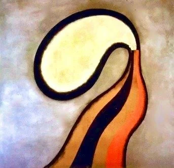
Queen Louise of Prussia, 1964
Buoninsegna, 1962
Professor David Bindman wrote in the St. Catherine’s Catalogue introduction :
Anthony Benjamin is exceptional among modern painters because he assimilates elements of earlier painting into a completely contemporary style. Benjamin has progressed beyond a Dadaist view of the past and is able to see earlier art as a valid influence instead of finding it a hindrance to free expression … a year spent in Italy (1960-61) helped Benjamin break away from the orbit of St. Ives and resolve his crisis. The exhibition covers the work done since his return from Italy until recent months, so one can follow the development of his present style from the time of his rejection of abstract landscape. The earliest canvases show strong influences of medieval Italian altarpieces, especially the Duccio Maesta in Sienna.
Over several years following the Italian trip, Benjamin developed these works, which defied easy classification. If the artist related one, Queen Louise of Prussia, 1964, to a work by Joan Miró, others seemed to echo, formally, the reliefs and paintings of Hans (Jean) Arp. Some seemed to derive from nature, others from the imagination. Critics struggled to explain and describe the works, even as they enjoyed their patently affective beauty. An anonymous Times critic thought ‘the botanical analysis of a flower’ was often suggested, and the ‘fragmentation of a Buddhist mandala’; Bindman, writing for the catalogue at St. Catherine’s College, Oxford (below) described the Hiatus series that dominated 1963 in terms of ‘forms dividing’ suggesting an organic comparison … and an Australian critic found ‘organic and mathematical connotations’ in Benjamin’s forms, some of which were reflected from curved surfaces, others were like wriggling shapes seen through a microscope.
Dr. Chris Stevens, in his book Anthony Benjamin 1931-2002, p. 15.
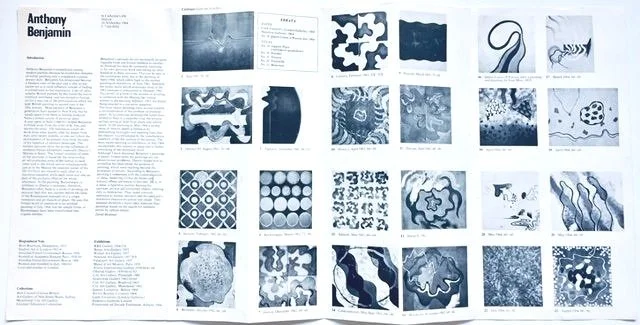
Catalogue for St. Catherine’s Junior Common Room Exhibition, 1964
Tolomei, 1962
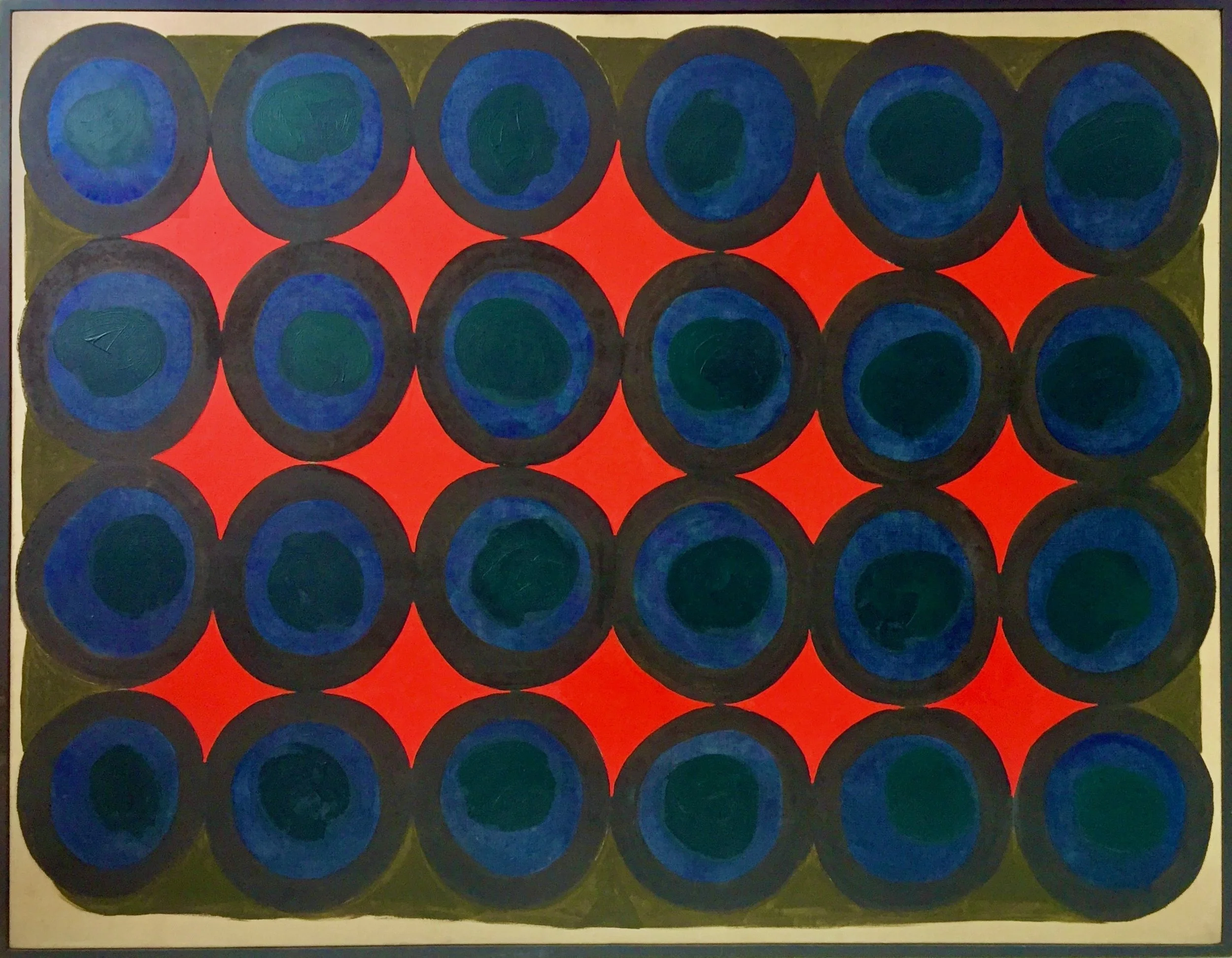
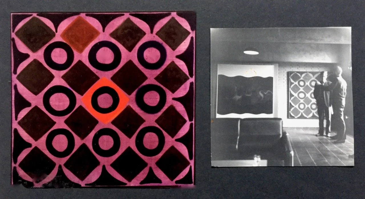
Saracini, 1962 (above), St. Catherine’s College,1964 (right). Writer/critic Oliver Bradbury and the gallery director
The manipulation of ‘signs’ instead of ‘gestures’ and the organization of the canvas surface in a flattened, sequential, semantic complex, instead of the singular, vertical and amorphous space of Abstract Expressionism, was the formal language that Benjamin began to map out for himself through a series of exhibitions.
Ken Coutts-Smith, artscanada, Spring, 1972.
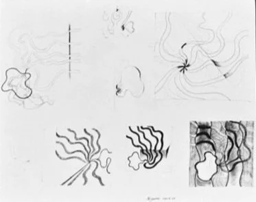
Mixed-media drawing, 1963

1963-64 Experimental Pegged Canvases
Benjamin was intent on blurring the boundaries between his work in two, and three dimensions in his painting, and his sculpture. He came up with the idea of inserting one- inch pieces of ⅜ inch diameter wooden dowel, into regularly spaced holes drilled in the stretcher bars. He then pulled the canvas tightly over the protruding pegs to form a wavy surface along the edges of the canvas, instead of the usual flat one. It was a challenging four-handed job to stretch the canvasses, and because of the considerable increase in the tension on the material, it required the best quality linen to take the extra strain on the fibres.
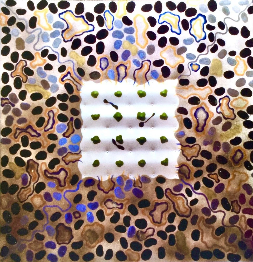
Never shy about maneuvering any skilled workers in his orbit to engage in his projects, Benjamin extended the idea by persuading the cooperative stretcher maker to produce an octagonal stretcher (right) and another one with a square of ply attached to the cross bars to place the pegged texture at the centre of the image (above). The results were intriguing, and he went on increasing the size up to 5 foot wide, but decided for practical reasons to place the projecting pegs on the outer bars only.
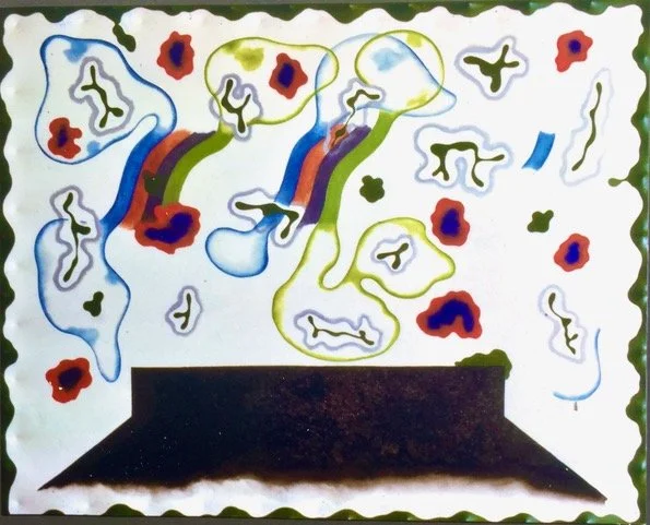
The image he named Etruscan (below) had a strange, wild celebrational gaiety about it that all who saw it responded to. The pegging technique produced a built in frame effect when painted with a glossy green colour that worked well with the bright colour bands in floaty forms hovering over the flat black shape. This suggested an altarpiece or a tomb, to some viewers, or a roof top to others.
Ken Coutes-Smith used an image of Etruscan on the first page of his piece about Benjamin’s work in artscanada (Spring,1972).
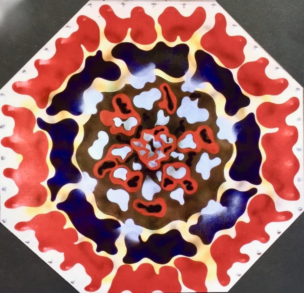
A Canadian acquaintance who was not normally a serious art collector was so delighted by Etruscan that he purchased it from an exhibition for the full public price but later attacked it with an axe in a drunken rage of mis-placed jealousy. Unfortunately, it was not just a single, one stroke repairable slash, like Benjamin’s mid-1950’s self-portrait had suffered—it was total terminal destruction!
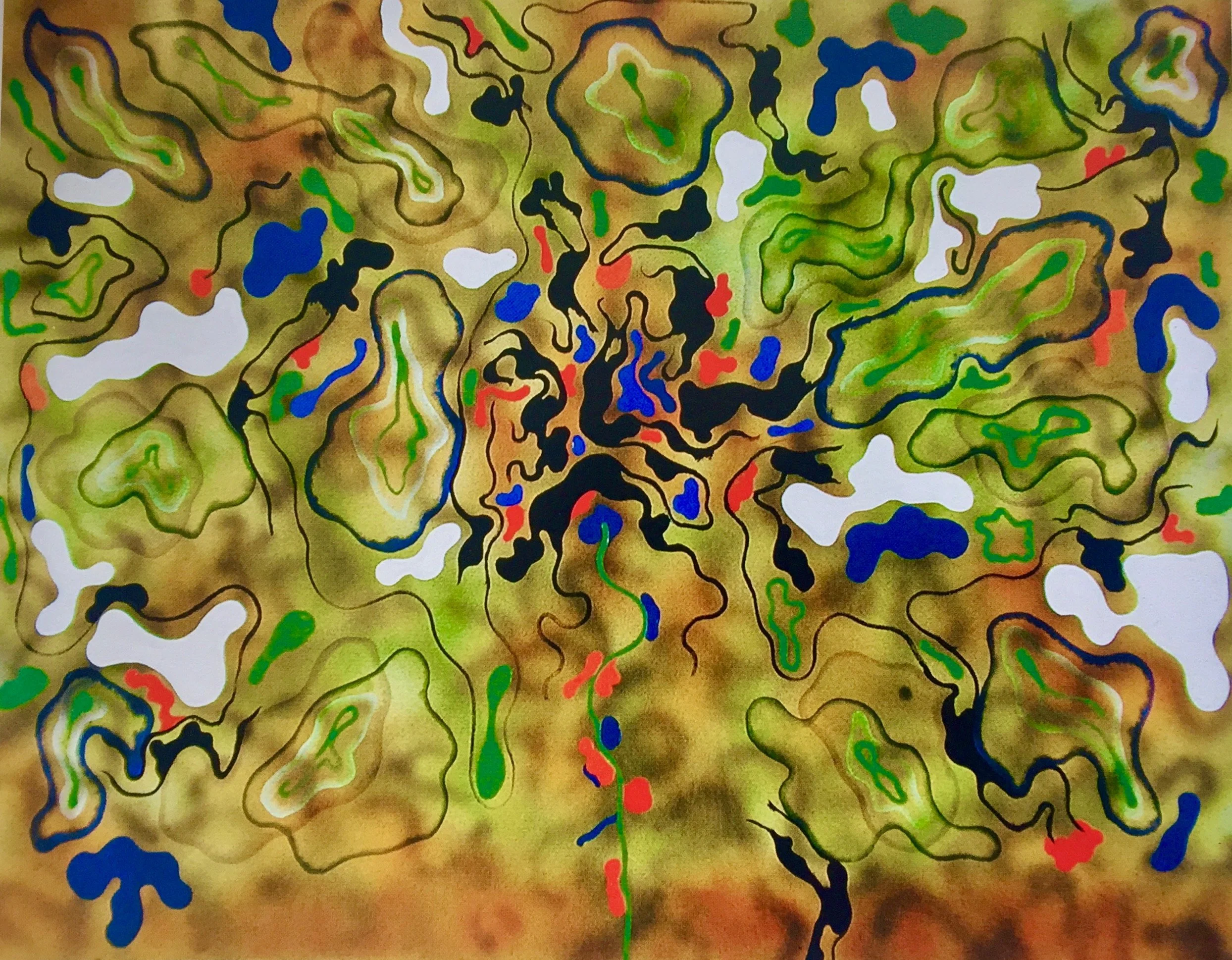
The Self-Centred Flower of Human Kindness (Gates of Eden), 1965
The paintings of 1961-66 are, perhaps, Benjamin’s greatest achievements in two dimensions. They are genuinely original contributions to the development of painting in Britain and had few parallels abroad. However, part of their strengths derives from their refusal of orthodoxies and Benjamin’s insistence on remaining outside the mainstream has almost certainly contributed to the marginalization of these works. In contrast to much of the earnestness of British art, these are consciously whimsical. Though non-figurative, they use the fragmented compositions of much 1960s (vide the early work of Hockney and Kitaij), rejecting the basic ‘rules’ of painting set out by Greenberg and Heron.
Chris Stephens, Anthony Benjamin 1931-2002
O
Etruscan, 1963