
1969-’72 - Trans-Atlantic Screenprinting
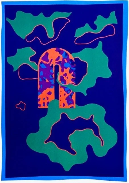
Benjamin took to Screen Printing right from the first project, a poster for the 1964 ICA Exhibiton. His prints were in many International Biennales, Competitions and Exhibitions; he was a awarded prizes at the 1970 Cracow Biennale for the 1969 screen prints - Odeon and Akhenaten, and exhibited in the Tokyo International Biennial the same year; he continued exhibiting and winning prizes everywhere. Studio International Magazine used an enlarged detail of one of the red and blue Floating Edge images as the eye catching cover of the April 1970 issue. As well as producing etchings in several different locations on both sides of the Atlantic, Benjamin continued working with the screen printer, Kevin Harris in London, gradually improving their collaborative, experimental procedures. The arch forms in Yellow Arch Style and Blue Arch Style were related to the metal arches in the sculpture, and the irregular floating shapes were similar to the cutout shapes in Perspex sheets.
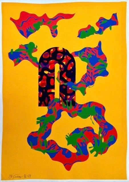
Yellow Arch Style , Screenprint 1969
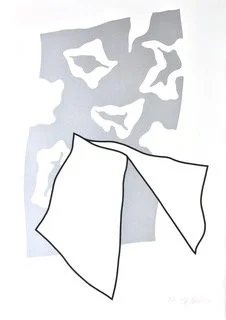
He also ‘recycled’ forms used in the earlier Floating Edge screen prints by cutting proofs up to make the floating shapes on Yellow Arch and Blue Arch, and added another layer of spacial interest by carefully trimming around some of the fine detail to extend the edge of the irregular form over the background colour. This was challenging work for Harris, but the more technical difficulties added to the stencil making, proofing, and printing process, the more he enjoyed making it all work, always cheerful and enthusiastic, as well as a perfectionist. He found a source of better silver printing ‘ink’ that was much easier to work with, as it did not clog the screen so readily. This inspired Benjamin to conceive a series of images related to the cloud forms and shinny metallic surfaces in the sculpture, and they slightly frivolously named the prints - ‘Silver Lovelys’ and ‘Pandora’s Pink Cloud’.
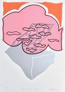
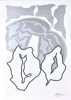
Pandora’s Pink Cloud II -1970
Silver Lovely I - 1970
Blue Arch Style, Screenprint 1969
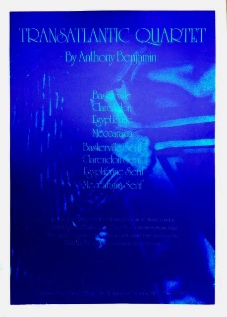
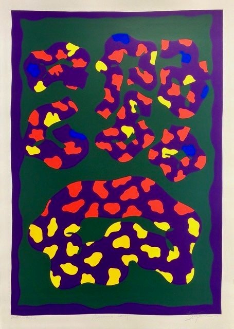
Transatlantic Quartet, 1972
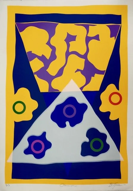
Clarendon
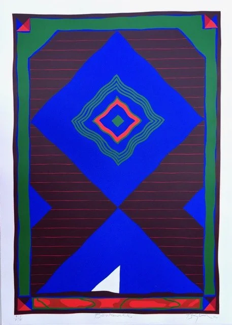
Baskerville
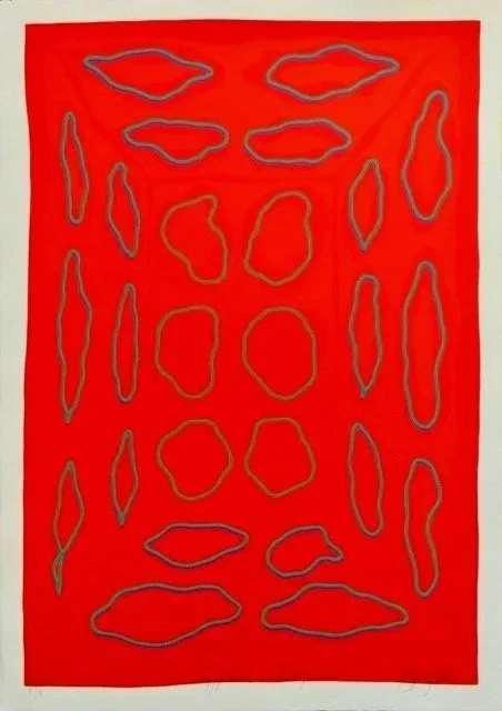
Egyptienne Serif
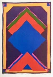
Baskerville Serif
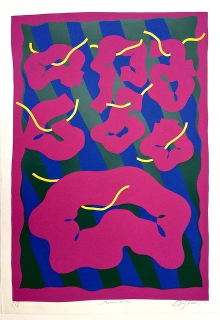
Meccarama
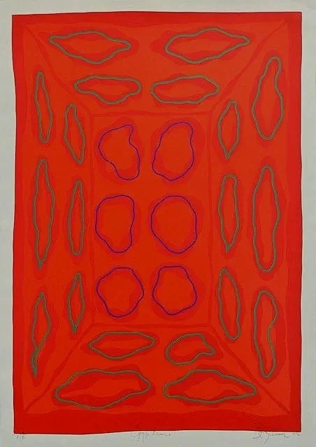
Egyptienne
“Much of the superb printing was done in Kevin Harris’s studio. These screenprints are all large and without exception, very powerful. They have been most successful and have established a strong idea of Benjamin as a printmaker — images derived from Art Deco or apparently abstract designs which explore the possibilities of describing images solely by means of colour…” (Attribution ??? probably Rosemary Simmons)
Meccarama Serif
Title page: Transatlantic Quartet, 1972.
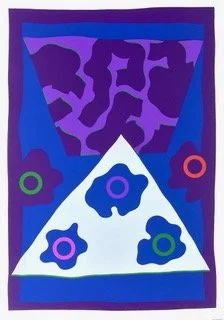
Clarendon Serif
The four titles in the Transatlantic Quartet Suite, are the names of four popular typefaces, each with a variant pair, with the term - ‘Serif’ added to the title. There were considerable differences in three of the four pairs -Clarendon, Baskerville, and Meccarama, but in Egyptienne, and Egyptienne Serif, the difference is so subtle, it is necessary to look at the two images together for a long time, to spot it. Sales in the gallery and on the road, were good, everyone was enthusiastic about the ‘possibilities’ and wanted more of his work… Benjamin and Harris really enjoyed working together and were happy to oblige. Benjamin had some very ‘colourful’ ideas ticking over!
Silver Lovely II-1970
Gorner & Millard were enterprising young dealers who set up to sell limited edition prints to provincial institutions- education authorities, libraries and galleries in the late 1960s, a happy time when those organizations had modest budgets to purchase art for their slightly bleak building and public spaces. Having achieved considerable success employing a team of hardworking agents who carried the heavy portfolios around the provinces to appointments with the directors and department heads, they opened a spacious gallery in South Kensington, and having done quite well with Benjamin ‘s limited edition prints, they commissioned a suite of eight images, in four pairs in editions of 95, named the Transatlantic Quartet.
These were shown at the Gorner and Millard Gallery in South Kensington, along with some etchings and drawings he made in Canada, along with some small sculptures in late 1972, when Benjamin was frequently travelling back and forth between Canada and Britain,Transatlantically, engaged in the complicated process of returning to iive in the UK, while continuing to make art.
“Several series of screenprints followed which used graphically different means -– largely flat areas of intense and vibrant colour — diametrically opposite to the fine line etchings, yet drawing on the same imagery … During 1970-73, the suites Transatlantic Quarter, Roxy Bias and Pre Packaged Phantasies were completed as well as Pier, in two colour versions and individual images. “
Rosemary Simmons on Anthony Benjamin, Arts Review, Volume XXIX No. 8, April 15, 1977.
4 non transatlantic postcards here(??)